![Ooowee logo designed by Karen Hsin](https://karenhsin.com/wp-content/uploads/2023/11/OooweelogoBG_2400x1800-1024x768.jpg)
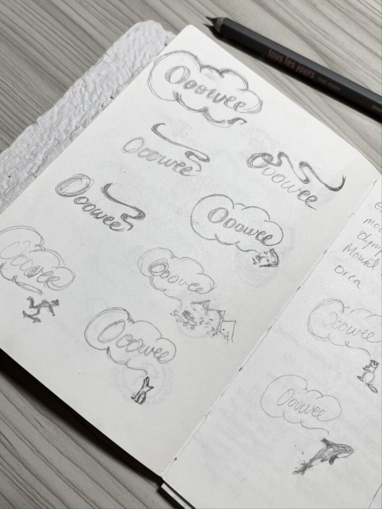
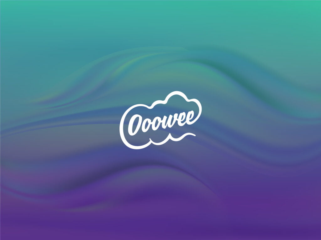
The Brief: To design a logo which captures the essence of Ooowee as an expression while conveying a fun, playful and lighthearted spirit without the use of typical leaf icons that have flooded the industry. A puff of cloud in the shape of a speech bubble pays homage to both the expression and the plumes of smoke often associated with cannabis.
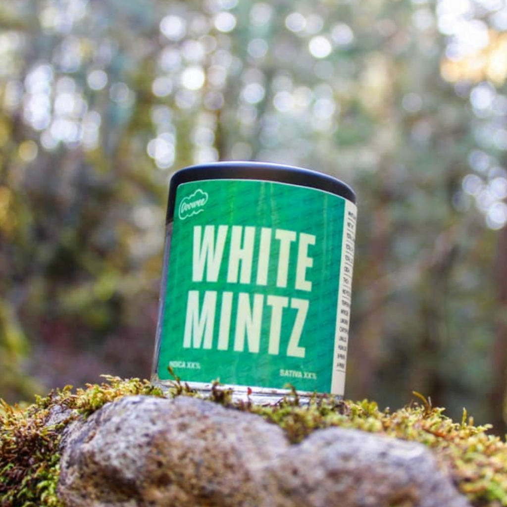
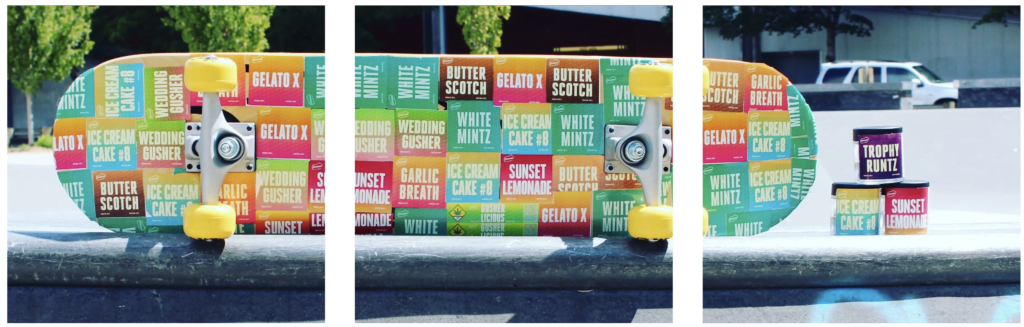
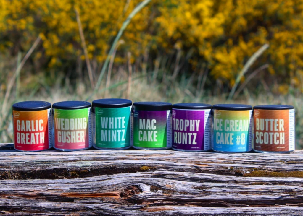
Packaging: A complete packaging lineup was designed to fit pre-existing jars and allowed for in-house production and printing.
![Sketches for Ooowee logo design by Karen Hsin](https://karenhsin.com/wp-content/uploads/2023/11/Ooowee-sketches_khsin-768x1024.jpg)
![Detail of Ooowee Jar Label by Karen Hsin](https://karenhsin.com/wp-content/uploads/2023/11/WhiteMintz_sq-1024x1024.png)
![Ooowee-Skateboard adorned with Strain labels designed by Karen Hsin](https://karenhsin.com/wp-content/uploads/2023/11/Ooowee-Skateboard-IG_-1024x327.png)
![Ooowee Jars Lineup designed by Karen Hsin](https://karenhsin.com/wp-content/uploads/2023/11/Oooweejars_lineup-1024x731.png)